Updates to the San Francisco Typographic Map
Ben Sheesley · May 13, 2016
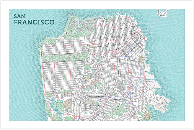
Ever since the San Francisco map sold out over the holidays we’ve been eager to get it reprinted and back up for sale. Of course, before doing so, we couldn’t resist making a few changes to refresh and update the design. The new version, pictured above, is the third in six years. Read down the page for a quick rundown of what’s new, or skip it and go straight to the typographic maps store where you can check out the map of San Francisco and our collection of other typographic cities.
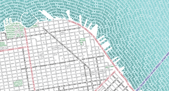
Blue Water
To further accentuate the peninsula, city, and coastline, the San Francisco Bay and Pacific Ocean were filled with a solid blue background color. Blue text in these areas now recedes into the background while the peninsula and city rise to the foreground.
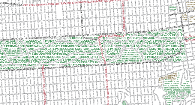
Stronger Parks
Large parks, such as Golden Gate and the Presidio, that had once been light green, were darkened so they would stand out better against the page background. These areas are important landmarks and by increasing the contrast, readers are more quickly able to get oriented.
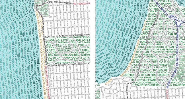
Beaches
Ocean, China, Baker, Marshall, and East beaches were added to the west and north sides of the peninsula. So as not to get lost among all the other text, they were given a unique font (Museo 500 italic) and color (beach-brown). The text is oriented to flow with the contours of the coastline.
Simplified Title
This isn’t really a neighborhood map, at least not in the way of some of our past efforts, where we’ve shown neighborhood names as a background layer (e.g., Chicago and Madison). So, gone is the long list of San Francisco neighborhoods that once hovered over the Pacific Ocean in favor of a cleaner space reserved for the city name alone.
We hope you enjoy the new typographic map of San Francisco as much as we do!