Creating a Quick Interactive House Prices Map with OS Data
David Heyman · September 24, 2018
This post originally ran on the Ordnance Survey Blog.
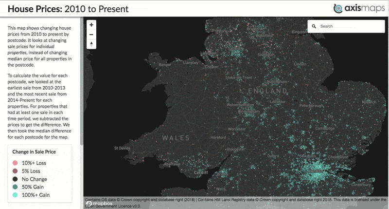
In my role as Managing Director, overseeing the operations of Axis Maps, I don’t get to make maps as much as I’d like. Last week I had a free day, so I figured I’d build a quick interactive map to try out some new tools and techniques for use in our future custom interactive mapping projects, and (data willing) show a new or interesting geographic phenomenon. The end result was this map, showing the change in house prices from 2010 - 2018 in England and Wales.
The Data
The primary thematic dataset for this map was the huge price paid dataset from the HM Land Registry. This 3.6GB CSV file contains every transaction from 1995 to 2018 along with price, address, category and other metadata. The address fields are particularly important because I wanted to visualize changing sale prices for individual properties, instead of changing median price for all properties in the postcode. To calculate the value for each postcode, I looked at the earliest sale from 2010-2013 and the most recent sale from 2014-present for each property. For properties that had at least one sale in each time period, I subtracted the prices to get the difference. I then took the median difference for each postcode for the map. This method was a bit more involved than just mapping the change in median price from a postcode, but I believe it is truer to what I was trying to map with the data. Unlike aggregated change, the price change of a single property has had a real positive or negative impact on a real person. It was that positive / negative financial impact I wanted to convey through data on the map.
With my house price data by postcode ready to go, I needed a dataset to turn my implicit geographic data (postcode text) to explicit geographic data (latitude / longitude coordinates). I downloaded Code-Point Open from the OS as point geography is more appropriate than polygons for viewing at the national scale. After transforming the British National Grid coordinates into WGS84 and joining it to my house prices data, I was ready to export GeoJSON and convert it into MBTiles, ready to go on the map.
Open ZoomStack
Thematic data cannot be displayed on its own. It needs to operate alongside a basemap to give it geographic context and help the map readers spatially orient themselves on the map. At this point, it would’ve been very easy to choose a nice pre-existing default and get on with it. However, I still consider myself a cartographer and a practitioner of deliberate and purposeful map design. I wanted the map to be a thoughtfully composed gestalt web-map and not just things (thematic data) on top of other things (base map).
…but I didn’t want to spend more than an hour getting it right.
For me, this was a perfect chance to give OS Open Zoomstack vector tiles a try. It comes pre-packaged as MBTiles (the same format as my thematic data), ready to be uploaded to Mapbox Studio without needing to mess around with the zoom level limits and generalizing required to get a massive amount of data into 500kb tiles. It has some excellent stylesheets that serve as a good starting point for turning the data into a map.
Beyond how easy it is to use, it’s also the right dataset for this particular map. In a thematic map, the basemap isn’t just for orientation and location. It provides crucial context for the thematic data, helping the map reader start to ask and answer questions about what they’re seeing on the map. In the case of this particular map of housing prices, the Open Zoomstack data provided essential context on building footprints and amenities (schools, green space, etc) that can help start to explain some of the data shown on the map.
Map Design: Putting It All Together
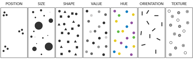
Now with the data acquired, processed, and uploaded, I could begin map design. When designing a map, there are 2 key principles that I’m always keenly aware of: visual hierarchy and visual variables. Visual hierarchy is the organization of design such that some things seem more prominent and important, and others less so. For this map, my thematic house prices data was the most important, so I needed to ensure it was the most visible element of the map. Visual variables are the different methods I could use to communicate geographic information through differences in map symbols.
With those principles and a general idea of how I wanted the map to look, I got down to styling. For this dataset, I really wanted to highlight both highly positive and highly negative change while clearly differentiating between them. To do this, I used a diverging color scheme that splits the data at 0 and uses hue (pink / blue) to indicate whether the change is positive or negative and lightness + saturation to indicate the magnitude of change. The end result is areas with high change (positive or negative) are the most visible on the map, while areas with less change are slightly less visible.
Note: With dark base maps, it’s important to choose a scheme that gets lighter in addition to more saturated as values increase, otherwise you’ll have a map where your highest values are lower on the visual hierarchy (i.e., least visible) against the dark background.
While I was iterating on the design of the thematic data, I was also working through the base map design. I started with the OS Dark style and modified it to reduce its visual impact to appear lower on the visual hierarchy and to get it to work more harmoniously with the thematic layer. The first step was to reduce the color saturation of all layers. Using the HSL sliders, I dropped the saturation to 0 on nearly every layer, making the map almost completely grayscale. I left slight hints of blue and green to help water and green space be more recognizable to the reader, but not enough where they would visually dominate other base map elements or interfere with the hues in the thematic map. Finally I went through each layer and tweaked its lightness to make them more or less visible based on how important I thought they were to the story.
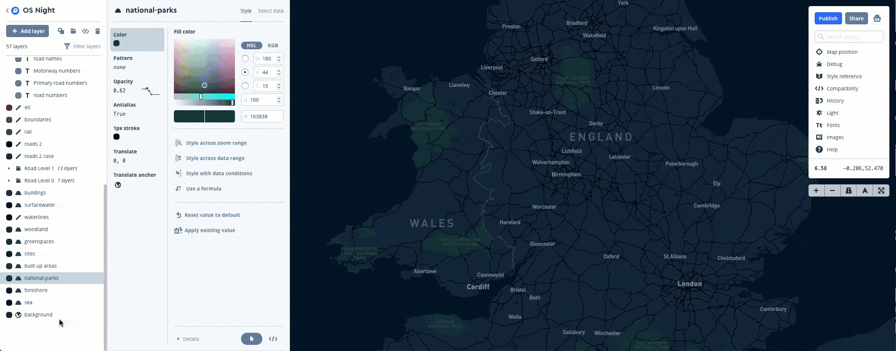
With the map design complete, I built a very simple map user-interface with a geocoded search. A data probe (info window) appears when mousing over a postcode point to provide information on-demand about the postcode name and the exact house price values. I also built a few simple slider filters for more motivated users who may want to dig deeper into the data. Since Mapbox GL JS did most of the heavy lifting, this was accomplished in around 100 lines of code.
Wrapping Up
The proliferation and simplification of map-making tools and resources across the cartographic process has made it easier to make maps than ever before, allowing us to make a map that would not have been possible 5 years ago in a day. Open ZoomStack is a perfect example of one of these resources. By handling the tedious tasks of data management and packaging the data in a ready-to-use format, I was able to focus entirely on the creative (and enjoyable) process of cartographic design. I could make a map in a day without sacrificing cartographic principles and compromise on effective visual storytelling.