Animating a temporal ton in a web map
Andy Woodruff · September 4, 2017
Boss:
"We need an animated map of this data set."
"It's by zip code."
"Over ten years."
"By week."
You:


We faced a challenge along the above lines earlier this year when we set out to visualize usage of rotavirus vaccines produced by Merck. Simple-sounding on the surface, it involved some tricky design and back-end work, notably because weekly data by zip code over ten years means more than 17 million data points: a ton of data for a web map to be loading.
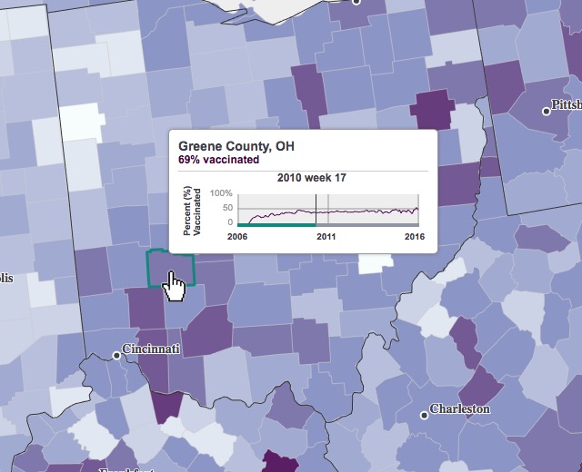
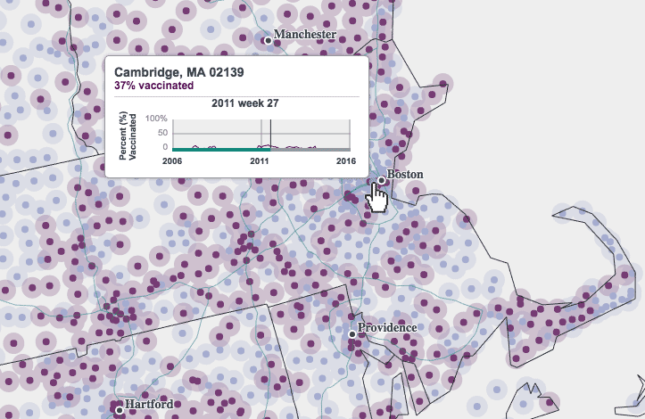
First, a brief overview of this map, which is at https://merck.axismaps.io/ or in a video demo below. It shows the percent of eligible children receiving a vaccine each week over approximately ten years at state, county, or zip code level. More detailed numbers are found in a chart at the bottom and by poking around the map. And that's about it. Simple, right?
Prototyping
This project involved several prototypes to work through design decisions. Although in the end it became a fairly straightforward choropleth and point map, the client and we wanted to explore some map types that we thought might best show the spatial and temporal patterns. Early on we had a request for the map to appear such that the entire United States, even unpopulated areas, are covered, to avoid suggesting that there are areas that the vaccines hadn't even reached. To this end we tried binning into grid cells, but that comes with a couple of problems.
There are places that zip code tabulation areas don't touch—because nobody lives there—so ensuring no blank space means a certain minimum grid cell size, which may or may not be a good resolution for the more populated parts of the country.
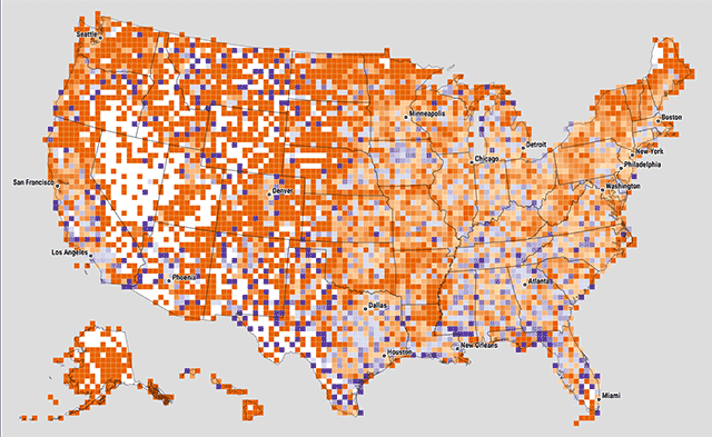
At one point we experimented with variable cell sizes, where each cell contained approximately the same number of zip codes. Big squares mean sparse populations, and small cells mean dense population, where there are a lot of zip codes in a small area. I'm still a little intrigued by this idea, but cartographically the effect is kind of opposite of the intended representation: all cells are meant to be "equal" in a sense, but the larger, sparser cells carry a lot more visual weight.
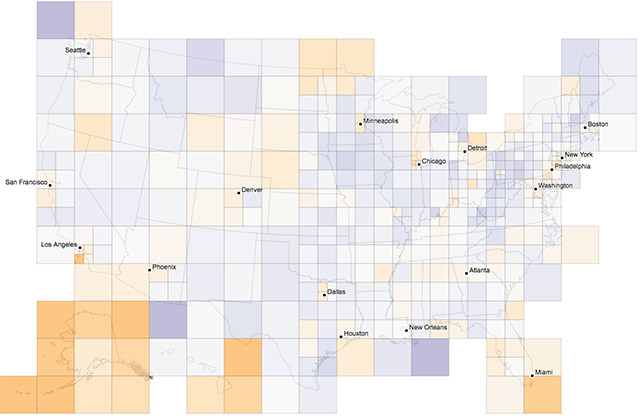
A second problem with binning is that it requires aggregations that depend on actually having the necessary data. In this case, we had vaccination rates already aggregated to geographies like zip codes, but we did not have the actual number of vaccinations and the total number of eligible children. Without those, we weren't able to display actual vaccination rates in a grid. Instead it was something like "percent of zip codes with rates above 50%," so for example if a cell had 100 zip codes and 40 of them had vaccination rates above 50%, the map would show the cell as 40%. This is a bit too convoluted and may not do a great job at showing real spatial patterns anyway.
Data overload: time
As previously mentioned, weekly data for thousands of geographies over ten years is a boatload of data, way too much for a simple web map to load up front. The default county map would be well over a million values, and that's one chunky CSV. A more efficient way to handle animated data is to deal with change in values, not values themselves. If a value for a county doesn't change from one frame to the next, there's no need to store data for that frame for that county. By pre-processing all the data with some fancy SQL to pull out changes, we can cut down significantly on the amount of data being sent to the map and improve rendering performance.
For states and counties, we use a 10-class equal interval classification, and for zip codes only two classes. Whenever a unit's vaccination rate moves it from one class to another, we store the date (week), FIPS code, and new class number. If it changes to, say, class 8 and stays that way for six weeks, we don't end up with six rows of data, but rather just one with the week when the class changed. A snippet of data looks something like this:
date,fips,newclass
...
200951,12015,1
201236,22107,6
201550,53031,3
...
Detailed data with actual vaccination rates is loaded on demand through a simple API to get values for a specific geographic entity.
To further reduce file size and smooth out the animation, we mapped 12-week rolling averages instead of single-week snapshots. The data tends to be unstable and noisy when and where there were lower populations of eligible children, so our hope was that averaging values over time would present a better picture of trends, while also resulting in fewer rows of change in our final CSV.
Data overload: space
Besides the attribute data load, a national map at the level of something like zip codes means too much geographic data. For one, it's another file size problem; for another, it's a legibility problem.
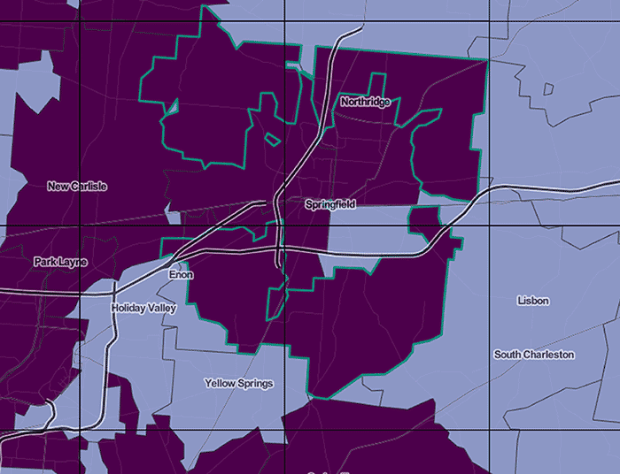
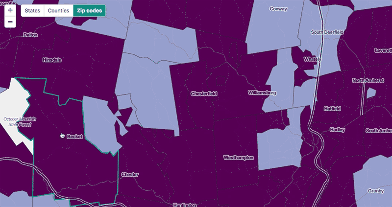
Legibility concerns led us to the zip code point map. At a national scale, even county polygons are pushing it in terms of crowding, and most zip code polygons are definitely too small to be discernable. Thus we make you zoom in pretty far before zip codes resolve to polygon representations; before that they're shown as centroid points, which are still crowded on a national map but are a bit easier to pick out.
Most of the map is drawn as SVG using standard D3 methods, but the zip code point layer is an exception. This many points, some 33,000, do not perform well as vector graphics and instead are drawn to a canvas element. It means some extra work to account for things like interactivity (we can't just attach mouse handlers and have to search for nearby points on mouse move), but it's worth it to avoid completely choking on rendering.
At the scale where we do show zip code polygons, the problem remains that this is a ton of geographic data. For this we built a simple Node vector tile server that sends the polygons in tile-sized chunks as topojson (and caches them to S3). We calculated and stored zip code centroids in a PostGIS database ahead of time, then can get the tiles by querying for centroids that fall within a tile's bounds. We use centroids instead of polygon intersections so that each polygon is only drawn on one tile—it's fine if it spills out into other tiles on the map as in the highlighted example below, but we don't want it being drawn multiple times.
On the front end, when the user zooms past a scale threshold, the map switches to a standard web Mercator map (using d3-tile) onto which we can load zip code tiles as the map is panned. (As a bonus we can also easily load reference basemap tiles underneath to help with orientation.)
Recap
A few things we learned about animating a ton of data over time:
- Animation can be hard to follow especially with so many data points. Explore ways to aggregate data (both spatially and temporally) that might be better than exact data values at showing trends. They may not work out, but it's worth investigating.
- Instead of loading all values, try loading only changes in values to cut down on file sizes; let exact values be retrieved in smaller doses on demand.
- Generalize! Different scales call for different complexities of geometry, and this can go beyond polygon simplification to things like collapsing polygons to points.
- Don't be mystified by vector tiles! It's not too difficult to make your own vector tiles for excessively detailed geodata.